Indoor golfBanners and logo files
A ball on a tee,
inside every C.

00The project
- Client
- BCTC Digit Golf
- Business
- Indoor golf simulators
- Years
- 2022–2023
- Banner
- 12 × 3 ft · 1400 × 350 px
BCTC Digit Golf sells indoor golf: a wall-sized simulator screen, a sensor on the ceiling, a hitting bay you book by the hour. Its logo is black and white, geometric and quiet, until you notice that each C curls inward at the foot like a ball sitting on a tee. For it the studio made a 12-foot banner and a web banner that put the screen, the name and the sensor in one line of sight.
- Print banner, 12 × 3 ft
- Web banner, 1400 × 350
- Logo files, black and white
- Social avatars
01The logo
Look again
at the C.
BCTC is set in round geometric capitals, with DIGIT GOLF spaced out between two rules beneath. The idea lives in the two Cs: the round counter is a ball, and instead of simply ending, the stroke turns in from both sides at the foot to hold it up — a tee. We prepared the logo as black and white files for print, screens and the profile picture.
 Black
BlackProfile pictures · 180 × 180

02The banner
Screen, name, sensor,
in one line of sight.
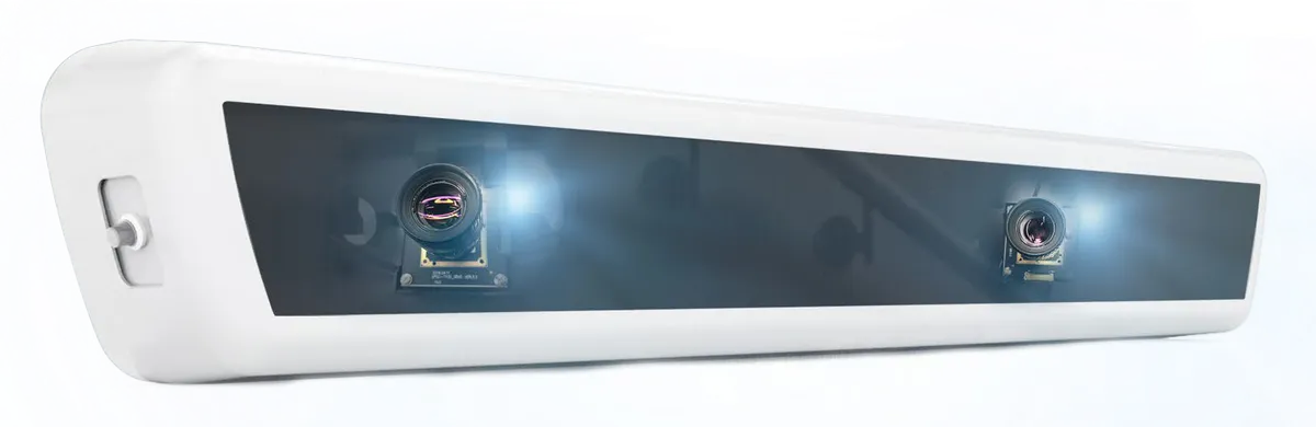
The banner reads left to right the way a visit does: the simulator room, then the name, then the Vision+ sensor that reads the ball. Five product lines run along the foot. It was printed at 12 × 3 feet and exported at 1400 × 350 for the web. Here it is re-set from the studio’s file: every piece kept, the grey decorative arcs and the washed-out fade taken away.
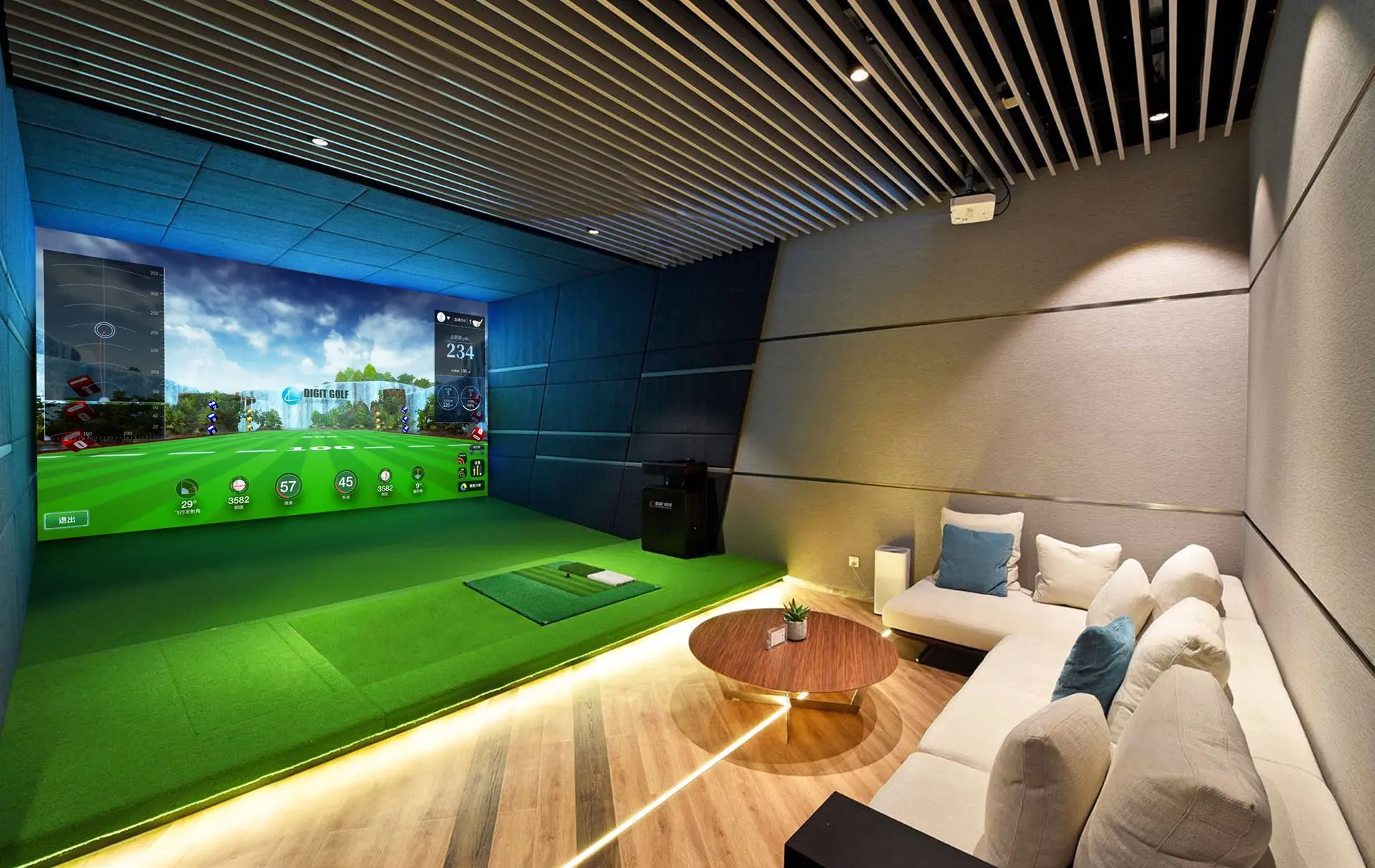
Print 12 × 3 ft · Web 1400 × 350 px
03The line-up
Five lines,
one system.
The row along the foot of the banner is everything BCTC offers: the smart system, two Digit Track simulators, bay bookings and the Vision+ sensor. On the banner they are one line tall; here they get the room.
- 01Indoor golf smart system
- 02Indoor simulator Digit Track
- 03Vision simulator Digit Track
- 04Indoor golf appointment
- 05Digit Golf Vision+