Salon & spaLogo design
Two Bs,
one flower.

00The project
- Client
- Bayside Salon & Spa
- Sector
- Hair, nails and care
- Year
- 2024
- Scope
- Logo design
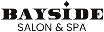
Bayside Salon & Spa, a salon for hair, nails and care, asked us for a logo in 2024. We drew five routes, from a script letter to serif monograms, and kept the quietest: two Bs set back to back into a four-petal flower. The wordmark is a heavy, notched display face with a four-point star for the dot of the i. The whole identity runs in black and white.
- Logo exploration
- Double-B monogram
- BAYSIDE wordmark
- Horizontal & stacked lockups
- Positive & reversed artwork
01Routes
Five routes,
one answer.
The working file keeps five routes: a script B, monograms in a ring, serif Bs back to back, and a four-petal flower drawn in a double line. A small star follows from the second route on; in the end it leaves the mark and moves into the wordmark.






02The monogram
A B and its mirror
share one stem.
Two Bs stand back to back and their four bowls become four petals. The whole mark is drawn as an outline inside an outline, so it reads as one unbroken ribbon. The petals sit on four equal circles that meet on the axes, which keeps the mark steady even when it is very small.
03The wordmark
A heavy face,
a star for the dot.
BAYSIDE is set in a heavy display face cut with small notches, like the nick of a pair of scissors. The dot of the i becomes a four-point star: the glint of a fresh finish. SALON & SPA sits beneath in a light geometric sans, light against heavy.

04Lockups
Across or stacked,
on white or on black.
The delivered file is four pages: a horizontal and a stacked lockup, each in black on white and reversed. A sign, a card or a profile picture each takes one page as it is.