Promotional displaysNorth America
Three pieces.
One mark.


00The project
- Client
- Assemble Studio
- Trade
- Promotional display products
- Year
- 2024
- Guide
- 25 pages · EN / 中文
Assemble sells promotional displays — banner stands, roll-ups, A-frames, backdrops and store fixtures, the things that hold other brands up. We designed its mark and a custom wordmark, and wrote the rules for both into a 25-page visual guide in English and Chinese.
- The mark, the A
- Custom wordmark
- Four colourways
- Visual guide, 25 pages, bilingual
- Business cards & roll-up banner
01The mark
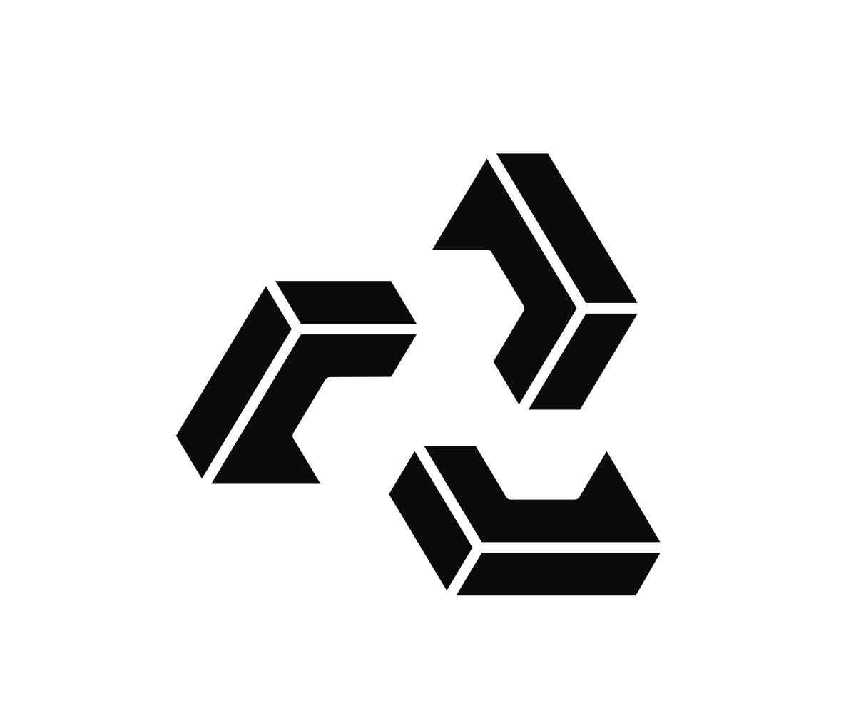
Three folded bands,
locked into a triangle.
Each band is a chevron and two short bars. Turn it 120° and repeat it twice, and the three bands interlock; the space they leave in the middle is an A, and the guide calls the mark just that — the A. Every edge runs in one of three directions, so it reads as a solid object, built from parts, which is what Assemble does all day.

02The wordmark
The letters are
assembled too.
The wordmark is a custom all-caps sans. The A drops its crossbar and splits in two; each E is three bars with no spine; the B has no stem; the M leaves a gap on its right. Every letter is made of separate parts, and the eye puts them back together.
- Lock-up
- The wordmark always travels with the A, never alone.
- The A, minimum
- 10 mm in print · 50 px on screen
- Wordmark, minimum
- 20 mm in print · 100 px on screen
03Colour
Black and white first,
then a band of amber light.
The guide builds on white and pale greys, with black for type and graphics or as a full ground. The key colour is an amber gradient — amber, goldenrod, light gold — dark at one end and bright at the other. A spectrum version is kept for the occasions that need more colour.
 Amber on blackBlack on white
 Reversed on amber
 Spectrum on grey
- WhiteCMYK 0 · 0 · 0 · 0
- Grey 1Cool Gray, 50% tint
- Grey 2PMS Cool Gray 1
- Grey 3PMS Cool Gray 3
- Grey 4PMS Cool Gray 7
- Grey 5PMS Cool Gray 9
- BlackCMYK 0 · 0 · 0 · 100
04The guide
Twenty-five pages,
in English and Chinese.
Brand, logo, colour, typography and imagery, with every rule written once in English and once in Chinese. One typeface throughout, Poppins: Regular and SemiBold for text, Medium and Bold for headlines.
Empowering your brand