Technology company · Toronto
An A and two strokes
that read All.
The project
- Client
- AllwinBnB Technology Inc.
- Location
- Toronto, Ontario
- Year
- 2022
AllwinBnB Technology Inc. is a Toronto technology company that came to the studio for its identity in 2022. In July we showed three directions; in August we drew a fourth — a green A with two blue strokes leaning at the same angle. Then we wrote it into a ten-page brand guideline and a one-page colour guide, and carried it onto the business card, letterhead and envelope.
- Logo concepts & final mark
- Brand guideline, 10 pages
- Colour guide
- Business card, letterhead & envelope
Concepts
Three first ideas,
then a fourth.
In July the studio showed three directions: an A with a rising arrow, a slanted AWB monogram, and an orange wordmark with its double l drawn as strokes. None went through as it was. The final, drawn in August, keeps the slant of the second and the strokes of the third, in blue and green.
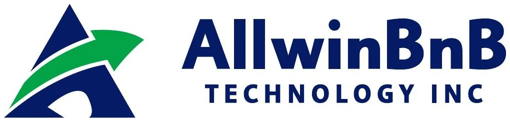
01July 2022 · not taken forward
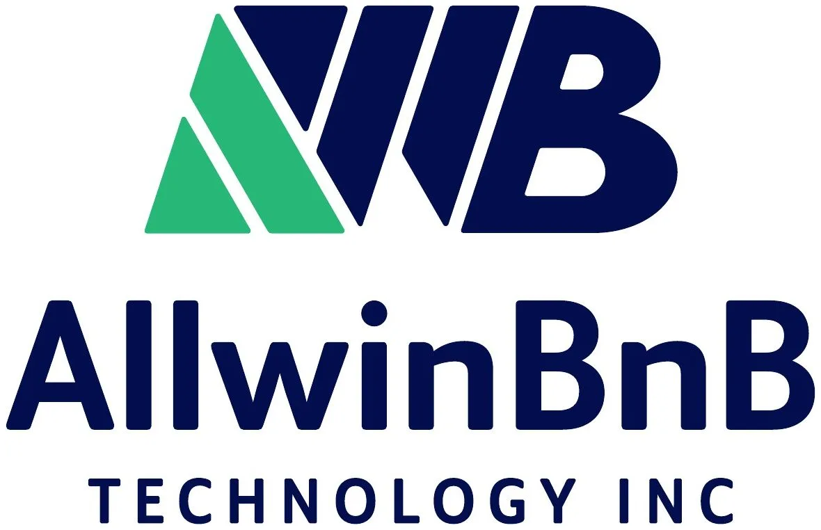
02July 2022 · not taken forward
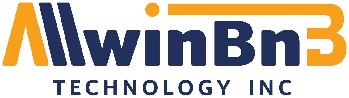
03July 2022 · not taken forward
04August 2022 · final
The mark
An A, two strokes,
and the word is All.
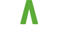
The green form is an A without its crossbar. The two blue strokes beside it lean at the angle of the A’s right leg, so the three read together as All — the first word of the name — and as a step forward. Every corner is softened to match the rounded letters of the wordmark.

Colour
Two colours,
and no third.
Green #5CAA37 for the A; blue #2759F4 for the strokes and the name. The guideline gives both in screen and print values, and allows four versions of each lockup: full colour, white, black, and the negative on blue, where the A stays green.
RGB 92 170 55 · CMYK 69 10 100 1
RGB 39 89 244 · CMYK 81 67 0 0
- Vertical · colour
 Vertical · white
 Vertical · black
- Vertical · negative
- Horizontal · colour
 Horizontal · white
 Horizontal · black
 Horizontal · negative
Guideline
Ten pages
to keep it that way.
Logos, dimensions and safety area, colour, examples — and along the foot of every page the same request: no editing, changing, distorting, recolouring or reconfiguring the logo. Blue headings and plenty of white make it read like a manual.
Stationery
All the way down
to a business card.
Card, letterhead and envelope share one detail: a blue rule along the bottom edge with a short green one beneath it. The back of the card is solid blue with the negative vertical logo and nothing else. The sample names, phone numbers, emails and addresses on the originals are left off here.
App icon
Small enough
for an app icon.
The guideline’s last example: the symbol alone as an app icon. The three strokes stay distinct at small sizes, on blue, white or black.


Three strokes,
one direction.
AllwinBnB Technology Inc. · Toronto · 2022