Financial servicesGreater Toronto Area
Building legacies,
beyond numbers.

00The project
- Client
- Aegis Financial Group Inc.
- Practice
- Tax & accounting · Insurance · Real estate · Wealth
- Languages
- English · Chinese
- Year
- 2026
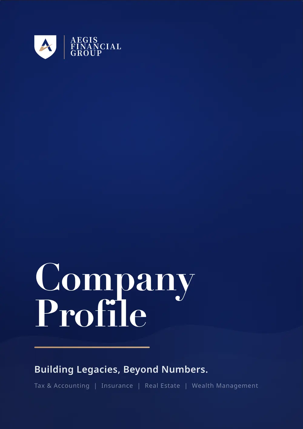
Aegis puts tax and accounting, insurance, real estate and wealth management under one roof, and its whole case is that they work as one. The brand had to say that calmly: a shield, an A and a single copper stroke; navy and ivory; serif titles; and the same order on paper and on screen, in English and in Chinese.
- Shield mark and lockup
- Business cards
- Bilingual company profile
- Bilingual website
- Roll-up banner
- Social and WeChat graphics
01The mark
A shield,
and one stroke forward.
The mark is three paths: a navy shield, a white A, and a copper stroke cutting through it like a signature. We kept the geometry exactly as drawn in the final logo file and set it two ways: a navy shield on paper, an ivory one on the navy of covers, cards and screens. The name stacks in three lines of serif capitals beside it, behind a hairline.
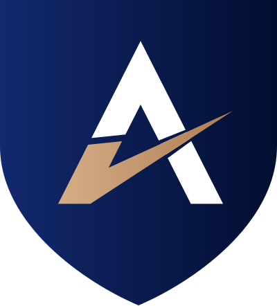

Shield gradient #12296E → #020E31
Stroke gradient #D5AE86 → #B07D55
Paper and the reversed shield
02Company profile
Twelve pages,
one line of argument.
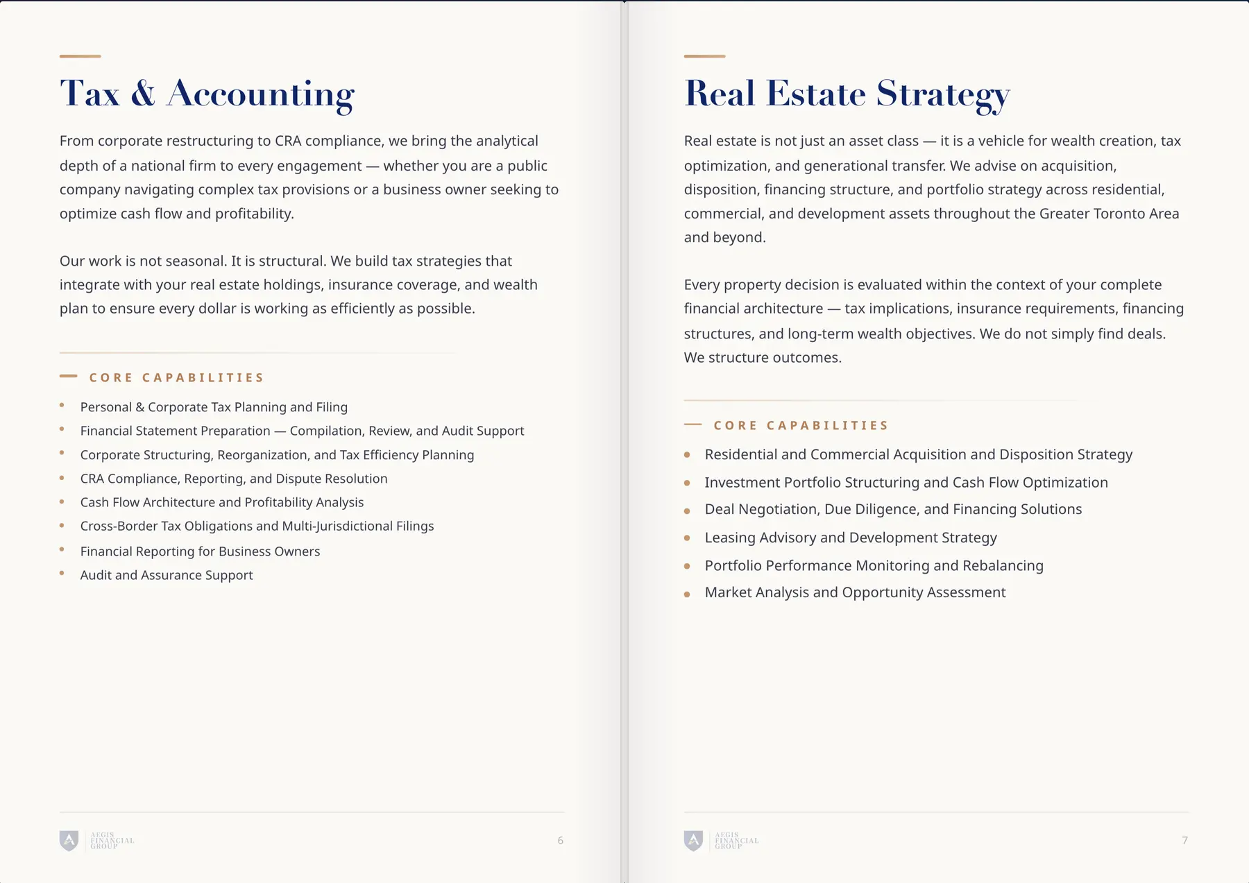
Contents, overview and the integrated advantage come first; then a page per discipline, each with the same anatomy: a copper rule, a serif title, two paragraphs and a list of core capabilities; then results, the four-phase process and the back cover. It lives on the website as a page-turning edition in English and Chinese, with a PDF to download.

03Website
On screen,
the same voice.
The site carries the profile’s order online: a navy opening with “Building Legacies, Beyond Numbers”, then pages for services, team, results and contact, with the company profile inside. Every page switches between English and Chinese, so a client can read all of it in either.
Build a structure.
Not just a portfolio.