General contractorGreater Toronto Area
AEVUM Construction — Built to
last.
- Project
- Launch kit
- Client
- AEVUM Construction
- Year
- 2026
- Card
- 3.5 × 2 in
- Flyer
- 8.5 × 11 in
- Banner
- 33 × 81 in
- Website
- aevumca.com

00The project
- Client
- AEVUM Construction
- Trade
- Residential and commercial contracting
- Region
- Greater Toronto Area
- Year
- 2026
A contractor starting out doesn’t need a slogan first. It needs things it can use tomorrow: a card to hand over, a flyer to leave behind, a banner to stand up at a show, and a website for the client to find that evening. We made all four speak the same language — navy for the ground, gold for the point, English and Chinese side by side, so whoever picks one up can read it.
- Logo files, horizontal and vertical
- Business card
- Bilingual service flyer
- Roll-up banner
- Bilingual website
01The mark
A building
inside the A.
Two diagonal strokes make the A and a roofline at once; inside stand the towers, an eave below, and four small gold windows. We set it up as horizontal and vertical versions, in colour and reversed, and every piece that follows — card, flyer, banner, website — draws from those files.



RGB 15 50 93
RGB 192 147 58
RGB 220 184 103
RGB 247 243 234
02Business card
The front for the name,
the back for the call.
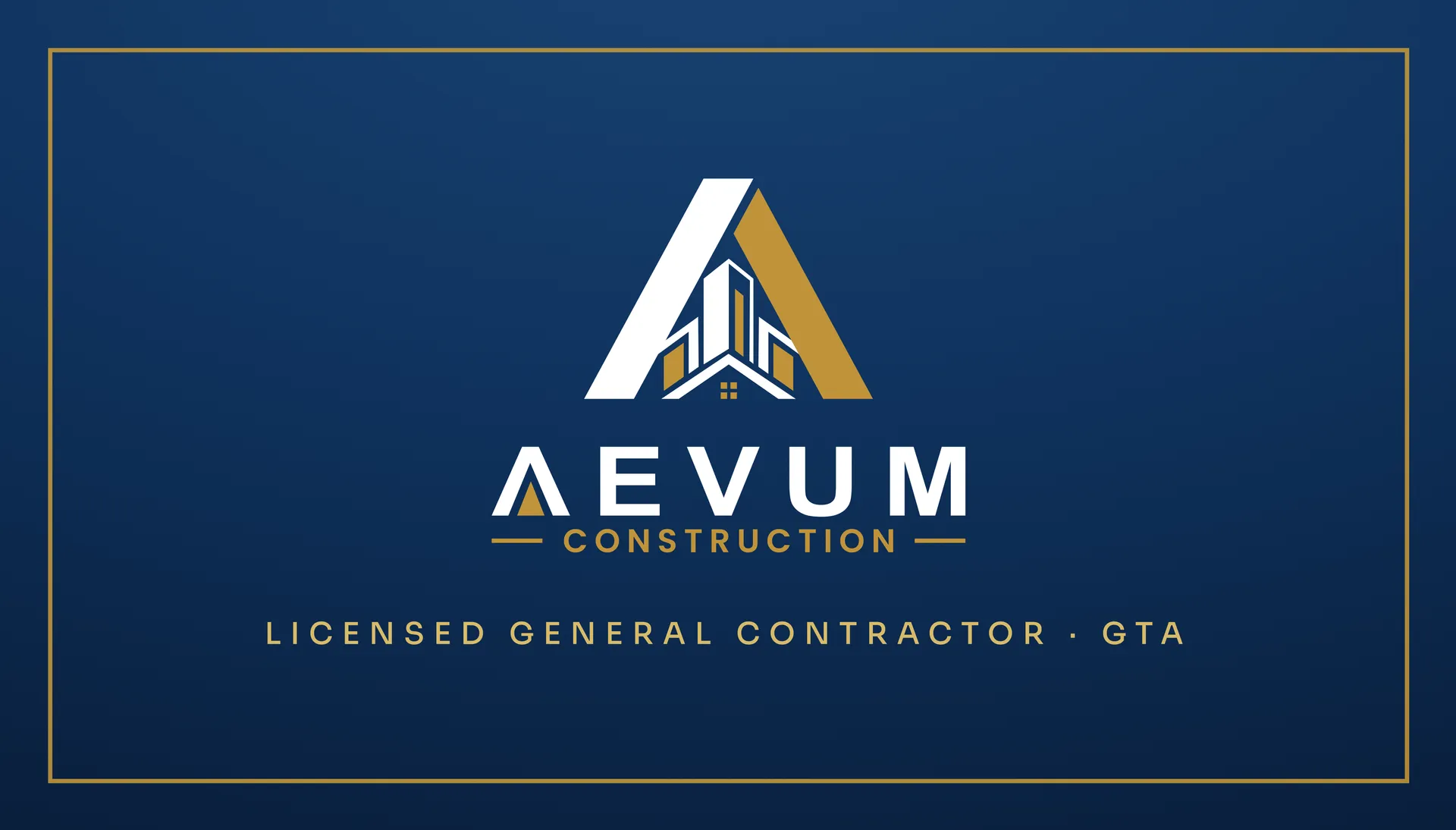
The front holds only the mark and one line — Licensed General Contractor · GTA — inside a fine gold frame on navy. The back turns warm white: name, phone, email and address in a single column, and a WeChat code on the right. The contact details are withheld here.
03Flyer, banner & website
One page, eight services,
two languages.
The flyer sets eight services in two columns, each with a gold line icon, the English title followed by the Chinese and a line of description in each language, and closes on four promises: registered in Ontario, a free on-site quote, fixed pricing, English and Chinese throughout. On the roll-up banner the same services become eight numbered tiles under three words, Built to last.; aevumca.com opens on the same navy, gold and headline, switches between English and Chinese, and has a quote builder and a project uploader behind it. The photographs in all three are AI placeholders until the firm’s own jobs are finished, so only the services are shown here.
- Flyer
- 8.5 × 11 in
- Bilingual, eight services
- Roll-up banner
- 33 × 81 in
- “Built to last.”, eight service tiles
- Website
- aevumca.com
- EN / 中文, quote builder, project uploader