DeveloperToronto · Booth and event material
Every address,
one red line.


00The project
- Client
- 95 Developments
- City
- Toronto
- Year
- 2025–2026
- Renderings
- Supplied by the developer
95 Developments builds in Toronto: office condos at 95 Corporate Centre in North York, and homes along Sheppard, Finch and Victoria Park. Through 2025 and 2026 the developer took its projects to events, and we made what stood at the booth — a wall that shows every project at once, posters that put the offer plainly, and a set of stickers.
- Booth backdrop
- Event poster series
- Stickers
- Unit-sheet layout study
- System around the existing mark
01Identity
A maple leaf
and two red lines.
The developer came with its mark: NF in a red cut-corner square, a serif wordmark, a maple leaf between two red rules. We left every path as drawn and built the rest around it — a reversed version for red grounds; one red, one ink, one concrete grey — and took the two rules as the thread that runs through every piece.

The double rule, lifted from the mark — under every name on the wall, the posters and the stickers.
As in the master file
For large red fields
Headlines and text
Ground

Project wordmark as supplied by the developer
02The wall
Five projects,
one voice.
The booth backdrop of early 2026 set four project logos side by side, each in its own typeface, with a gap between the red band and the buildings. Redrawn, the developer speaks for all of them: the red field holds the mark, and every project gets the same column — one rendering, the double rule, its name, its street.
Toronto
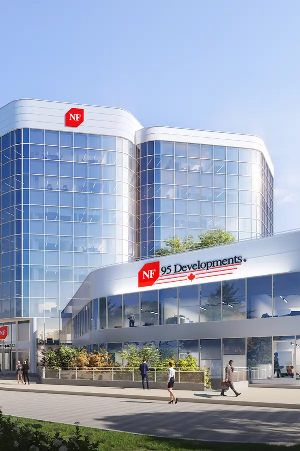
95 Corporate Centre
105 Gordon Baker
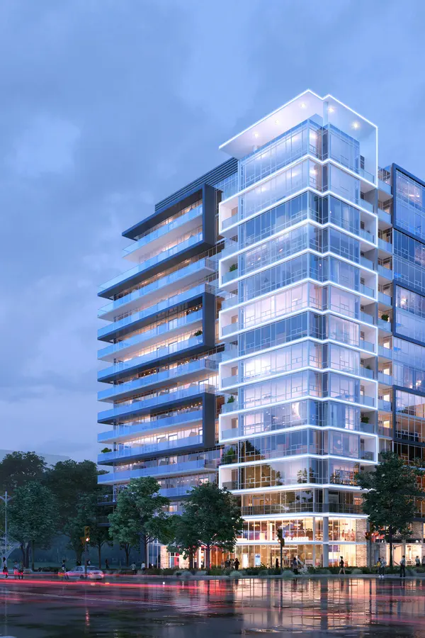
2992 Sheppard
2992 Sheppard
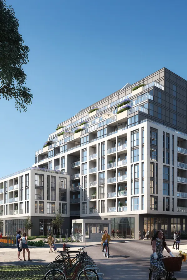
The Garden Series
3445 Sheppard
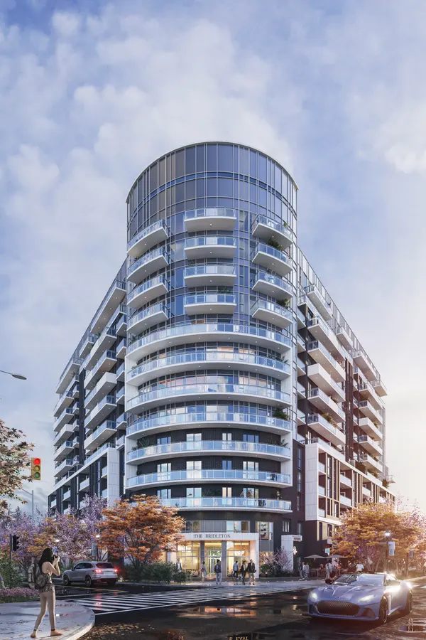
The Bridleton
3268 Finch
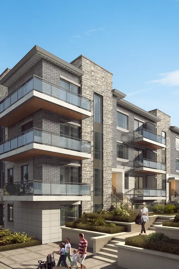
Victoria Garden
3453 Victoria Park

03At the booth
Say the offer,
then show the building.
The 2025 event posters were comic bursts and balloon type, with prices and a sports-ticket draw. We set the lines that mattered as one series — office condos and shared office at 95 Corporate Centre, rent-to-own at The Garden Series: one headline, one rendering, the street in a band, on white, red or ink. Prices and prize draws are gone.
North YorkOffice
condos,
North York.
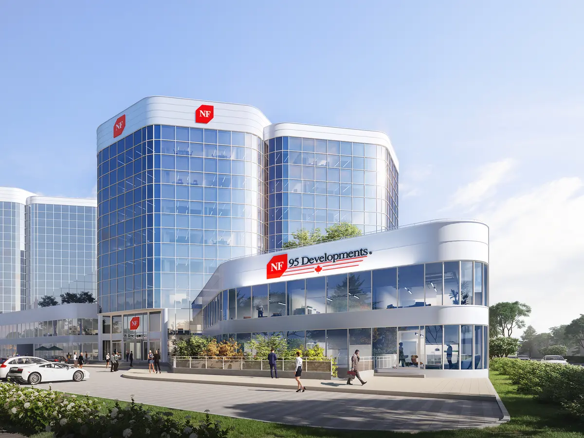
95 Corporate Centre105 Gordon Baker Rd
95 Corporate CentreShared
office.
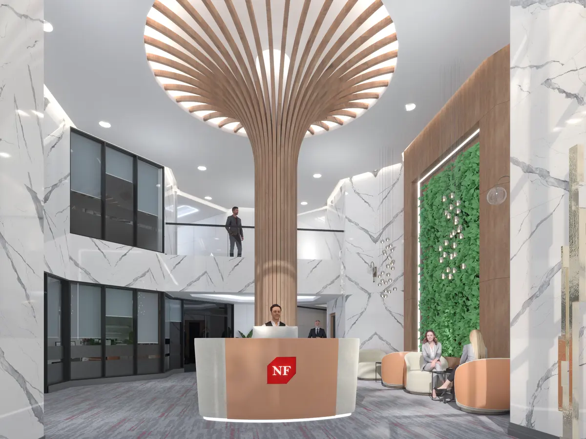
95 Corporate Centre105 Gordon Baker Rd
On SheppardRent today.
Own
tomorrow.
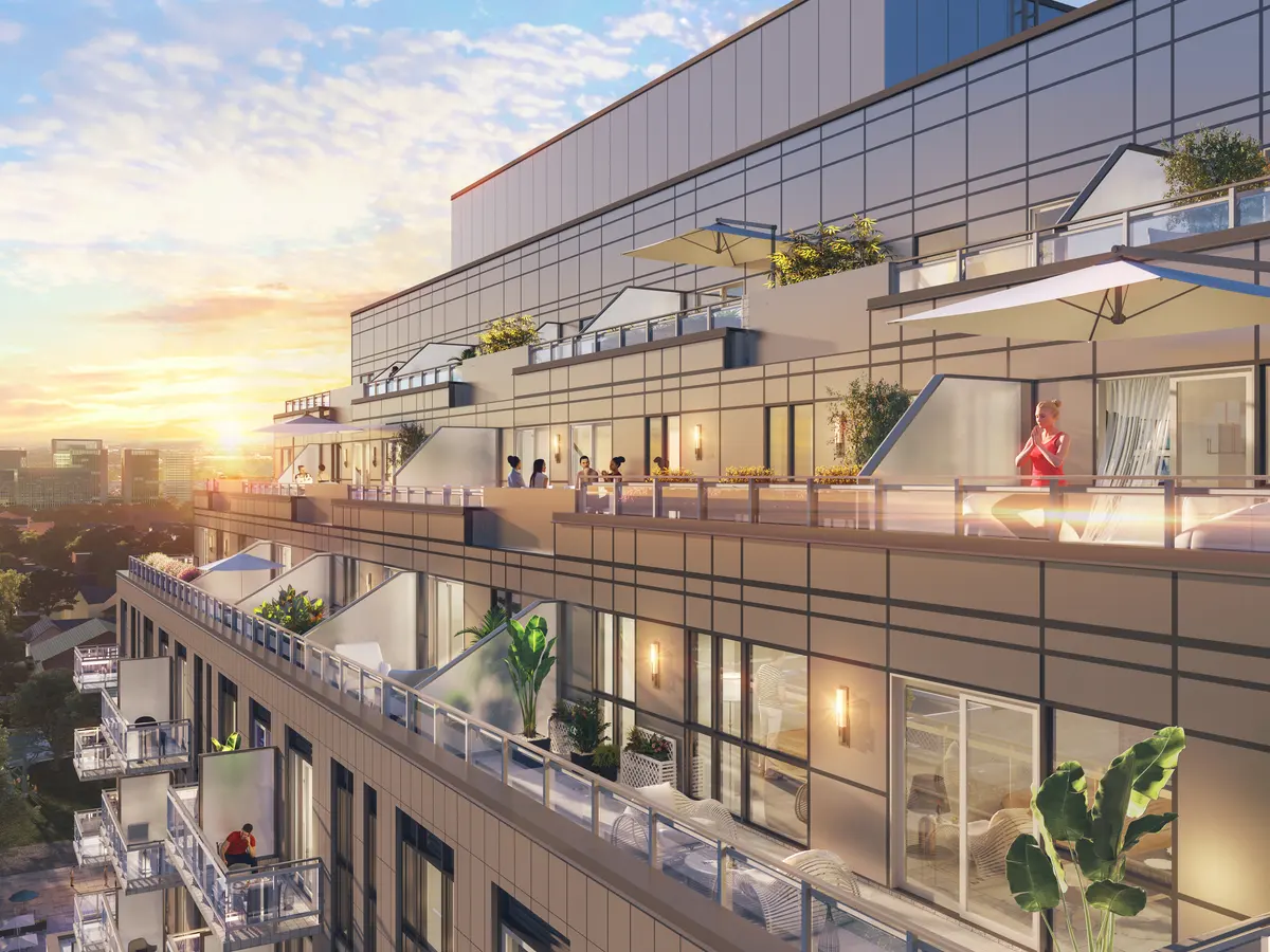
The Garden Series3445 Sheppard
Rent
to own
Start by renting.
End up owning.
Rent today.
Own tomorrow.
Stickers · the originals were comic speech bubbles; the lines are the originals’, set as three round seals.
04Unit sheet
From the building
to one unit.
A layout study for 95 Corporate Centre’s leasing material: area and unit numbers in a column of their own, the plan given open white space. Outline, door swing and dimensions are from the developer’s 2023 drawing, unchanged; red marks a single number.
- 95 Corporate Centre
- 2992 Sheppard
- The Garden Series
- The Bridleton
- Victoria Garden