CoffeeBrand study
A name read
off the thermometer.

00The project
- Project
- 175°
- Type
- Self-initiated brand study
- Year
- 2023
- Formats
- 16:9 · 1:1 · 3:4
175° is a coffee brand study the studio made in February 2023, with no client behind it. Its opening frame gave the reason for the name in one line — coffee is best served between 155°F and 175°F — and everything after it comes from that number: a wordmark with a red degree ring, and a dial where the handle of the cup is the needle.
- Wordmark
- Dial key visual
- Frames in three screen formats
Coffee is best served at a temperature between 155°F and 175°F.
01The wordmark
Three numerals,
one red ring.
The numerals are set in YuKyokasho, a Japanese schoolbook face whose figures look written with a pen: the 1 a single stroke, the 7’s bar turned down at its end, the 5 with a round belly. The degree sign becomes a ring in pure red, its top on the numerals’ cap line — the only colour in the identity, on a charcoal ground. Redrawn here in vector from the study’s files.

Charcoal#1D1D1D
Signal red#FF0000
White#FFFFFF
02The dial
The handle
is the needle.
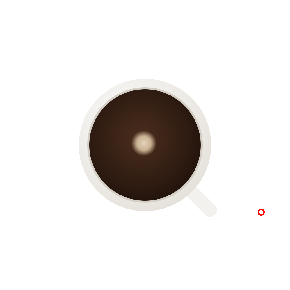
The study’s second frame looks straight down into a cup. A scale of ticks runs around it from MIN to MAX, and the handle points at the top of the range, where the name sits. The original cup was a stock photograph; here it is redrawn in vector, so the frame holds at any size. Each frame was exported three times: for the web, for Instagram and WeChat, and for Xiaohongshu.